metal head

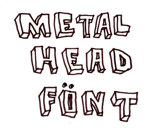
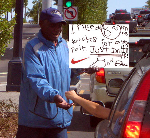
Looks like he spelled Vietnam “Vietnman”, but he got “appreciated” right. Everywhere I look lately design has reverted to high school metal head font. By that I mean very hand drawn looking, with letters given depth…wait, I have a computer, I’ll just draw an example and scan it. Hold on a minute.

That’s what I mean. It’s part of the cult of the ugly. At first I heard it explained as a result of computer rebellion. People were tired of the exactitude of computers. The mark of the human, the artist, was desired. I think it’s something else now. Hold on, I’m cooking dinner. Be right back.
Okay. There is an obvious nostalgia for the 1980′s in this font. It is also a nostalgia for the recent youth of the designers themselves. Hey wait a minute – is that really a Metal Head Font? It kind of seems like an early graffiti font. I need some input here. I grew up in a town of 2,000 people. I had no idea where these cultural tides were rolling in from. Guess I still don’t. But for the sake of moving forward and until I hear a decisive answer from the public, we’ll call it Metal Head Font.
I’ve seen enough old hand written letters from the 1920′s and 30′s on up through the war years that I can see that penmanship has not been taught as religiously as it once was. Perhaps that’s how we came to this bubble letter non-cursive print font you can see on all kinds of corporate advertising as of late.
Hey, that might be the difference, eh? Bubble letters were graffiti/hip hop influenced, and the straight edge letters are metal. Let me draw an example. Hang on.

So that’s the bubble letter hip-hop style. Also right out of the ’80′s. Let’s get our old yearbooks out and find out when that stuff started appearing in the autograph areas.
The Cult Of the Ugly was a treatise of sorts written by Steven Heller. I’ve taken his quote from John Cage here.
“Where does beauty begin and where does it end?†wrote John Cage in Silence (1961). “Where it ends is where the artist begins.â€
With that in mind, let’s go back to the panhandler’s sign at the beginning of this post. It won’t be long until corporate graphics are given this look by up and coming rebellious designers who’ve been hired to keep some shoe brand in touch with the dis-satisfied youth market.
